


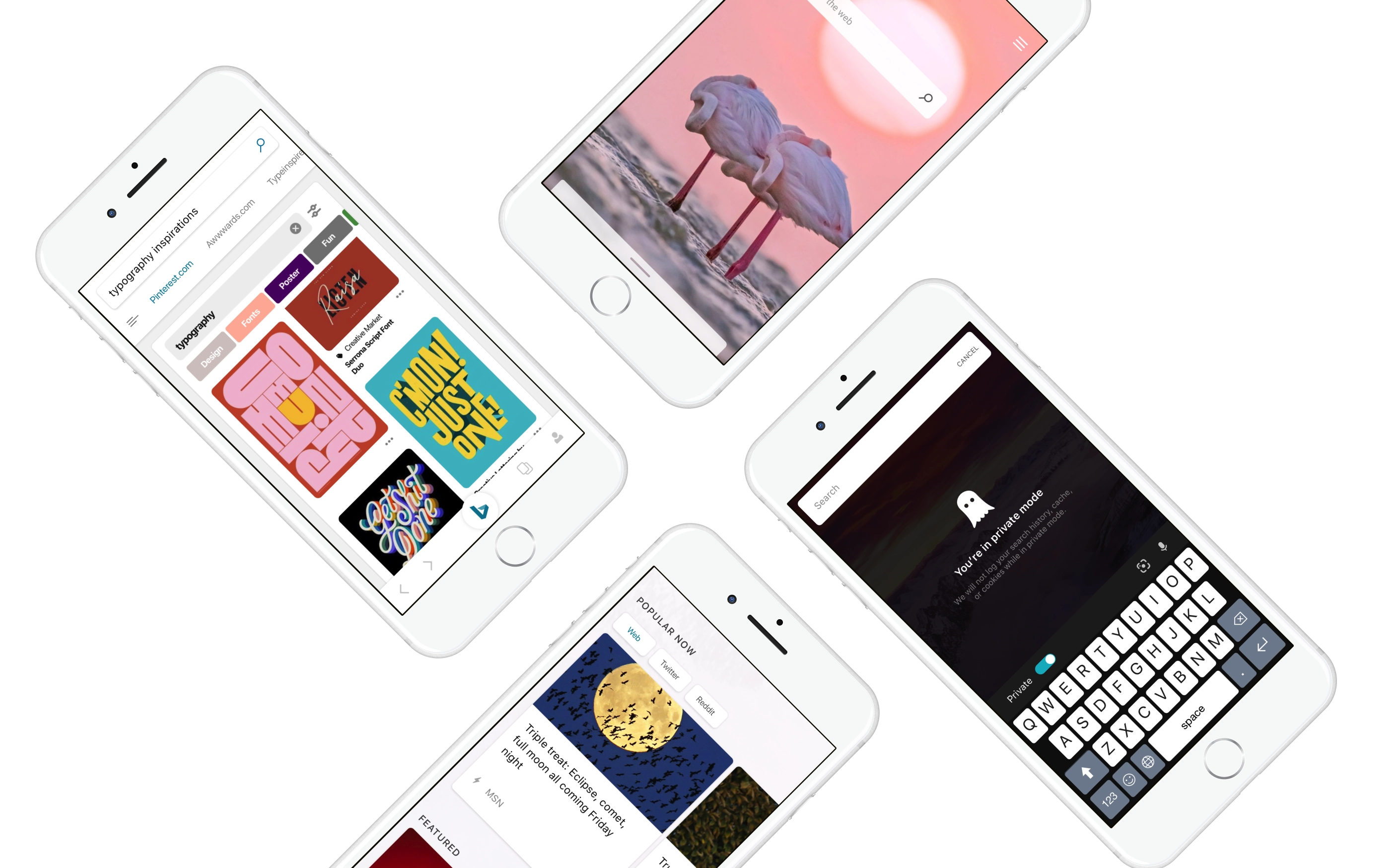
Search 2.0 — Reimagining Search experiences for a mobile-first world
Product Design Lead, Microsoft ・ 2017
Bing’s mobile experience was subpar both in terms of experience and usage. My role as the Design Lead was to relook the CORE aspects of search and reimagine for the user so they spend less time searching and more time doing. The business goal was to get more users using Bing on Mobile by creating an experience easy for finding, and browsing. Also until this project the codebase for m.bing, iOS App and Android App was different and to onboard a new experience was costly, with this effort the team wanted to unify to a single platform and experience.
Framing the problems
Search is a huge space, so we started with identifying bigger themes where the product experience was lacking. It was also an opportunity to attract younger audience to the Bing ecosystem. The team understood gaps through previous research, usage pattern and metics. Also I had been working in Search for a while so I knew the in’s and out of the whole ecosystem, gaps and areas to focus on. We identified core themes that would help ground the concepts and ideation in user’s and businesses best interest.
- 01Solidify the reasons for users to come back daily to Bing and make it a habit.
- 02Enable users to spend less time searching and more time doing. Allow for quick consumption and exploration.
- 03Increase trust with the users.
- 04Simplify the visual system.
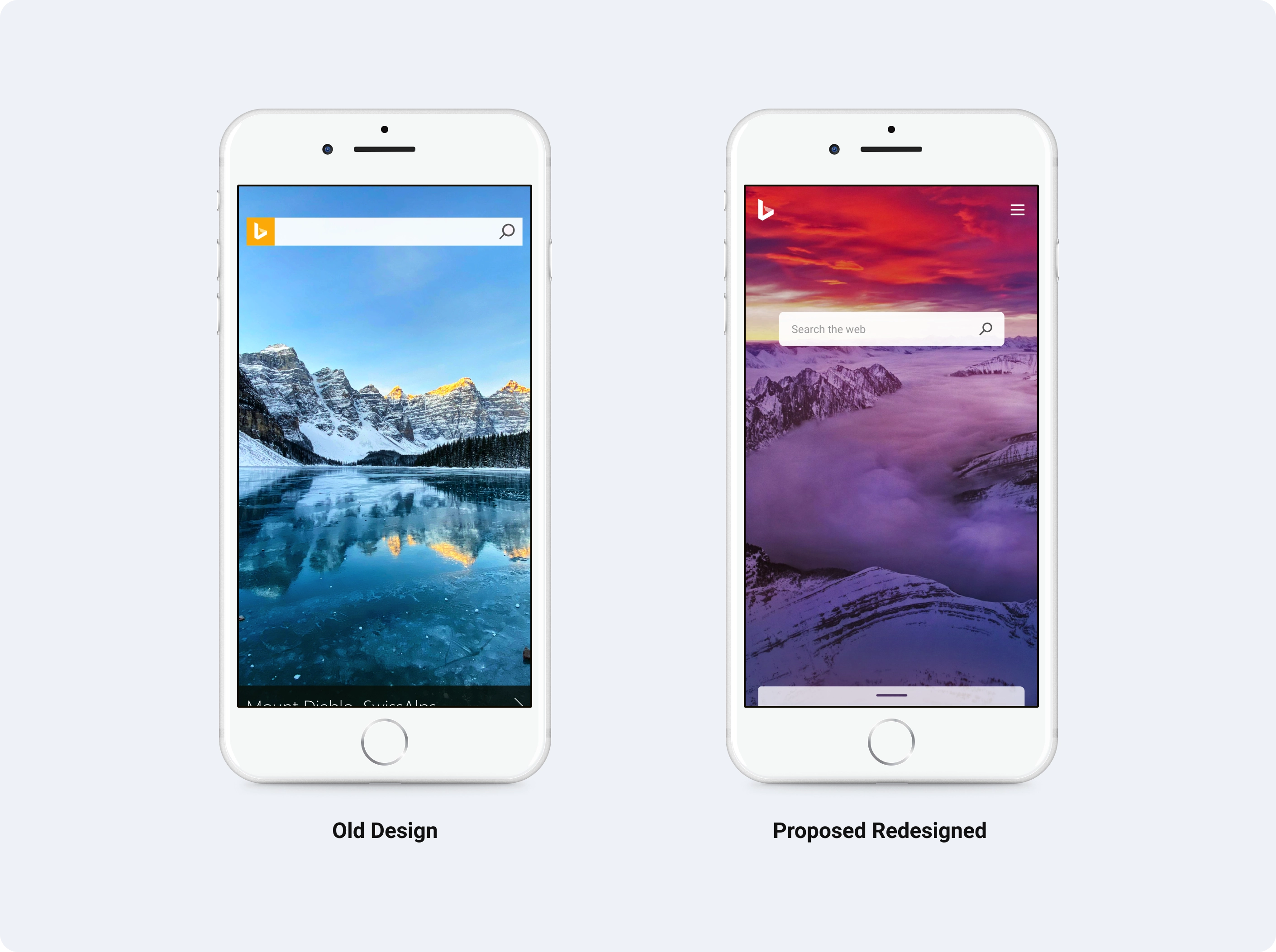
A more beautiful homepage
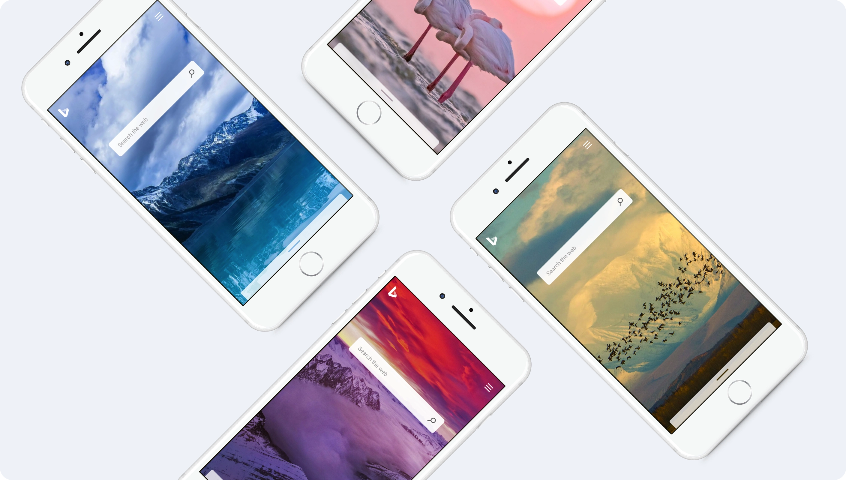
Bing Homepage image is iconic and a strong brand element. How do you create an even more beautiful experience? The homepage is just not about the search, but a lot of elements which make the bing experience. Homepage Feed, QF - Query Formulation, Search Results Page being the main ones.
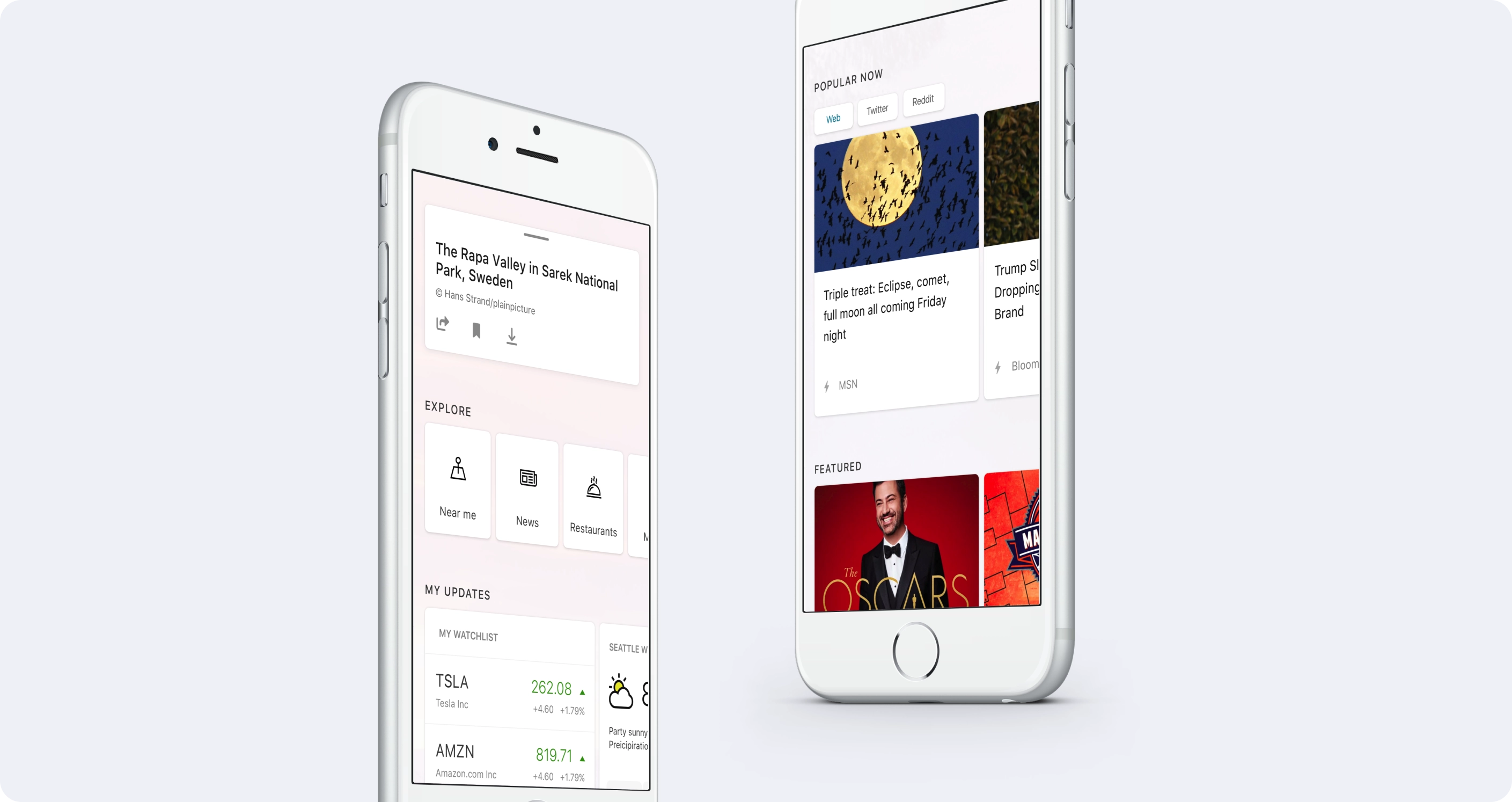
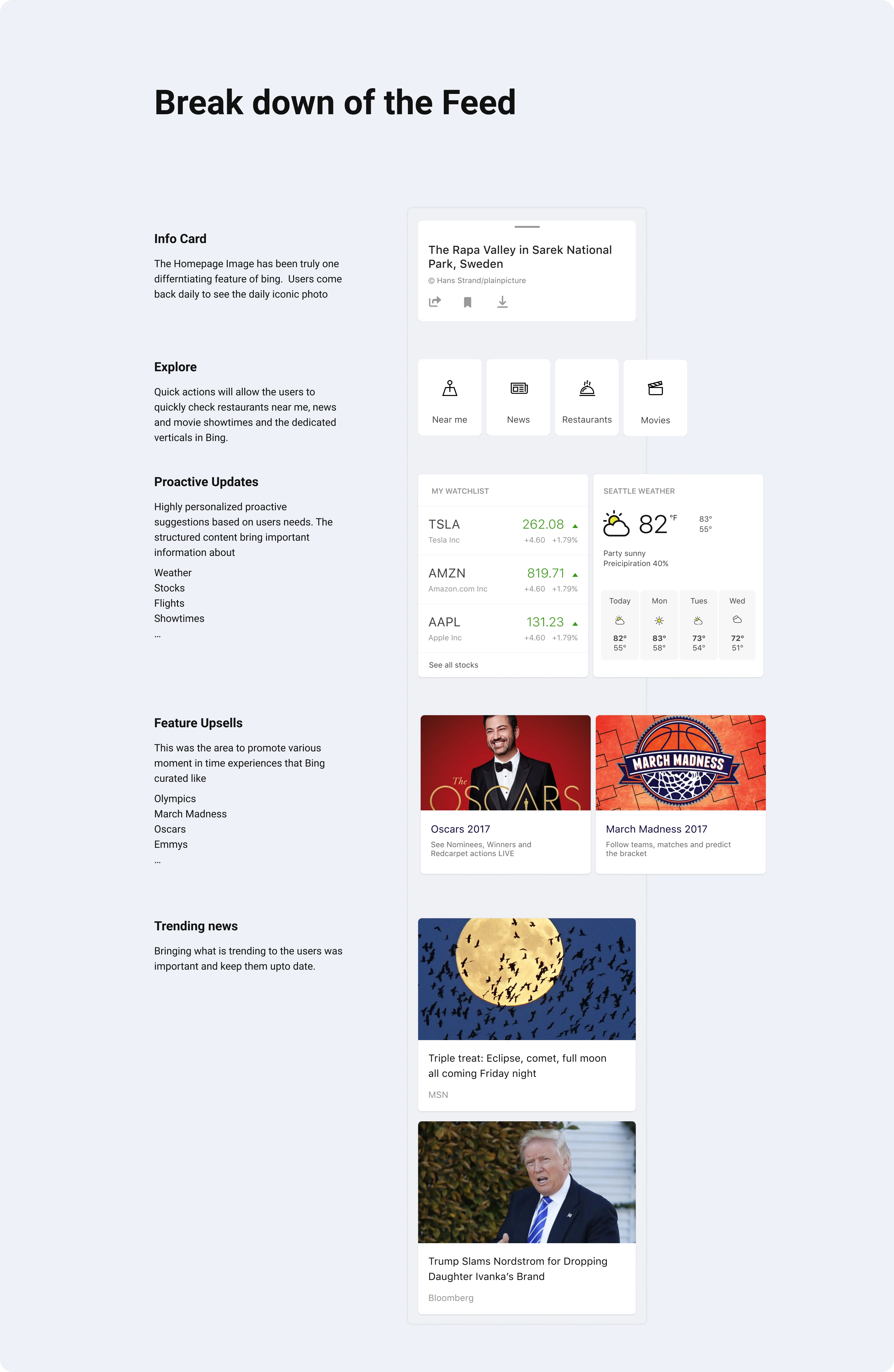
The Discover Feed — keeps users updated about their interests and helps discover the web
I explored new interactions for the feed and content organization. We also explored new card patterns to optimize for the content and overall a visual lift from the earlier experience.
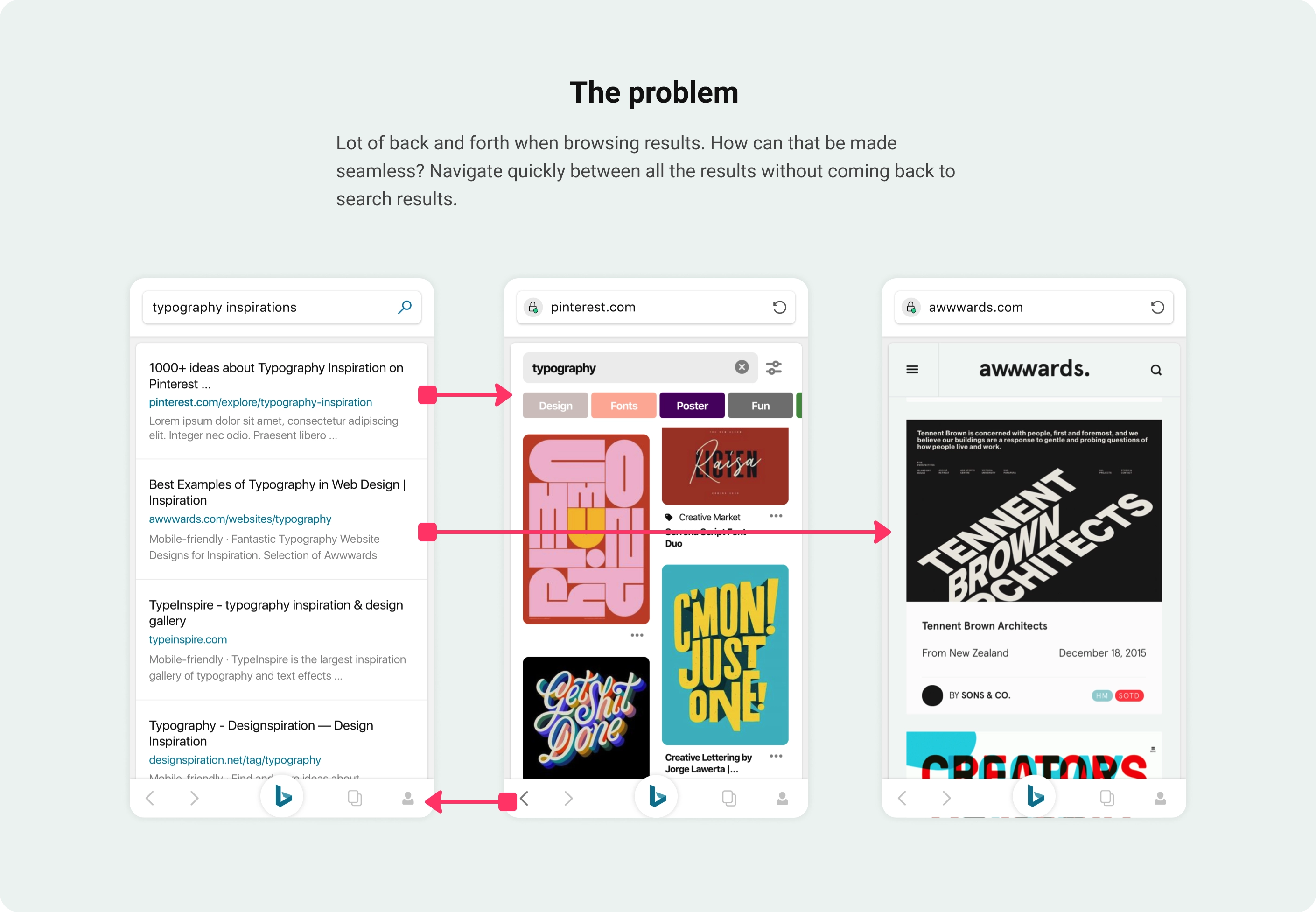
Exploring a seamless and efficient way to consume web results
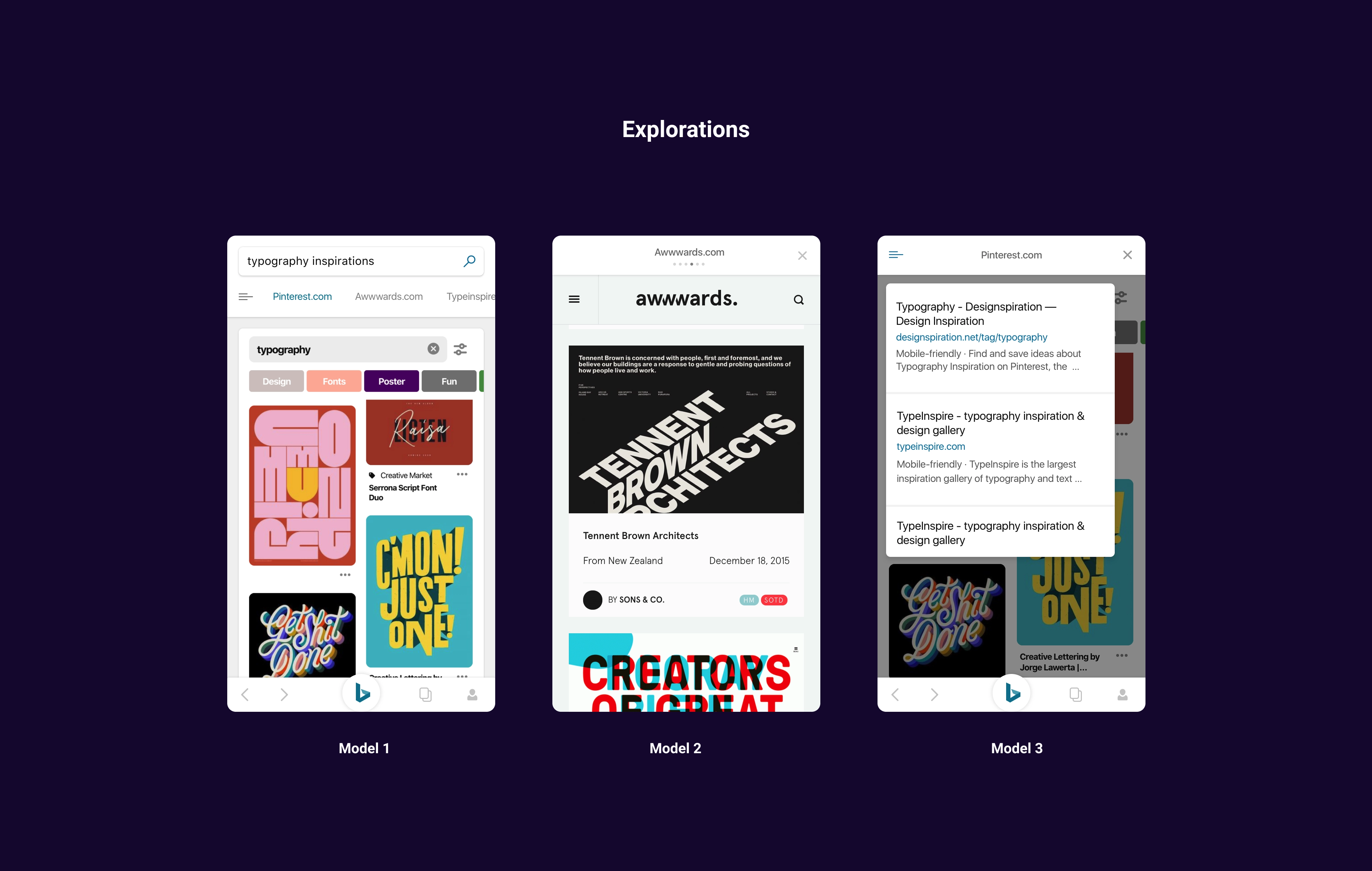
Final solution
Swipe to see results — no more back & forth
Organizing world’s information and bringing it to user’s fingertips have been core principles of Bing since it’s inception. Always kept our laser focus on enabling users to achieve task completition. This concept proactively brought information on the web in a bite sized card allowing users to explore without visiting the URL.
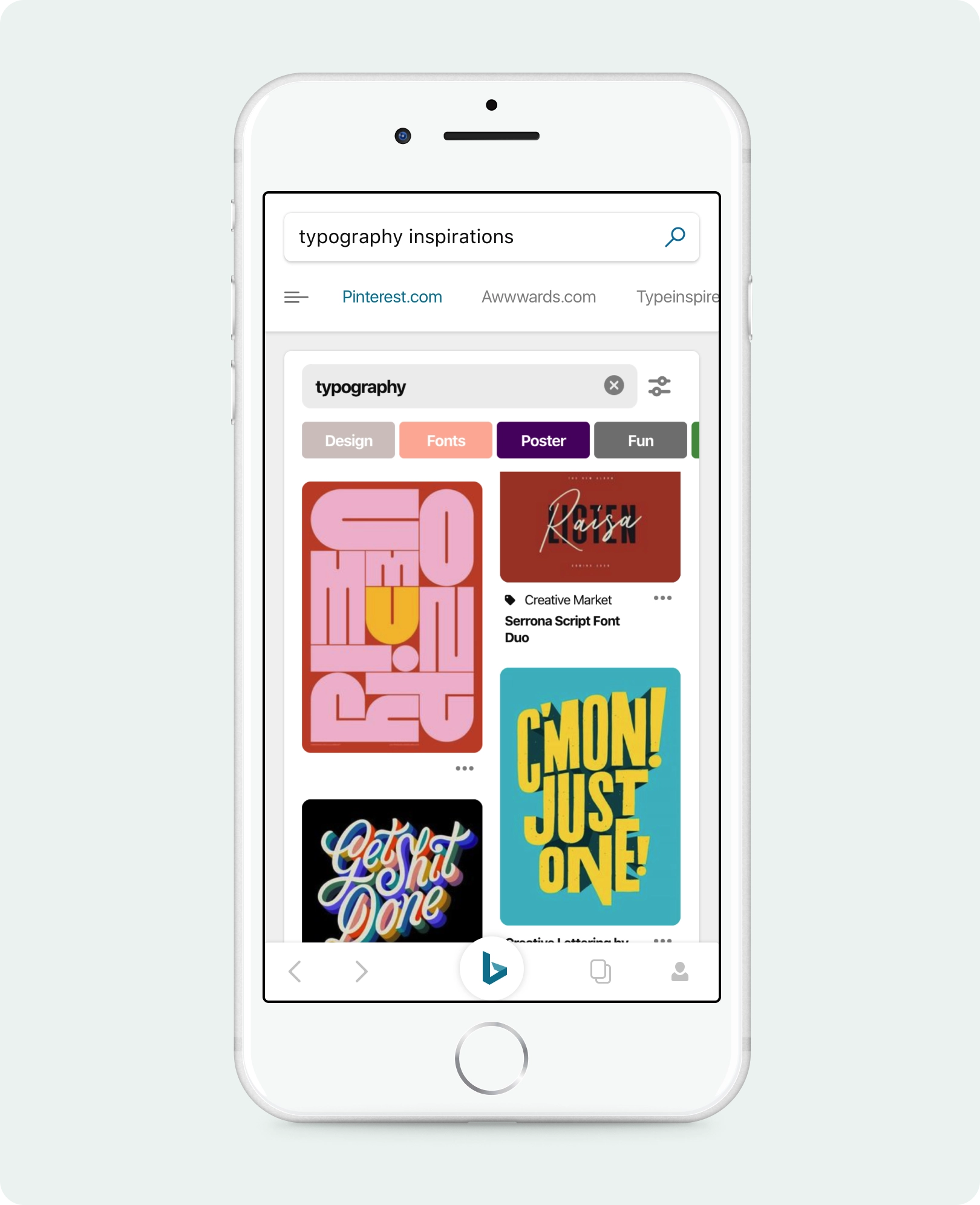
Enriching the Web Results
This concept would extract entities from the webpage and show structured entity cards as a carousel for users to explore quickly. Also they could easily expand to see more details of the entities.
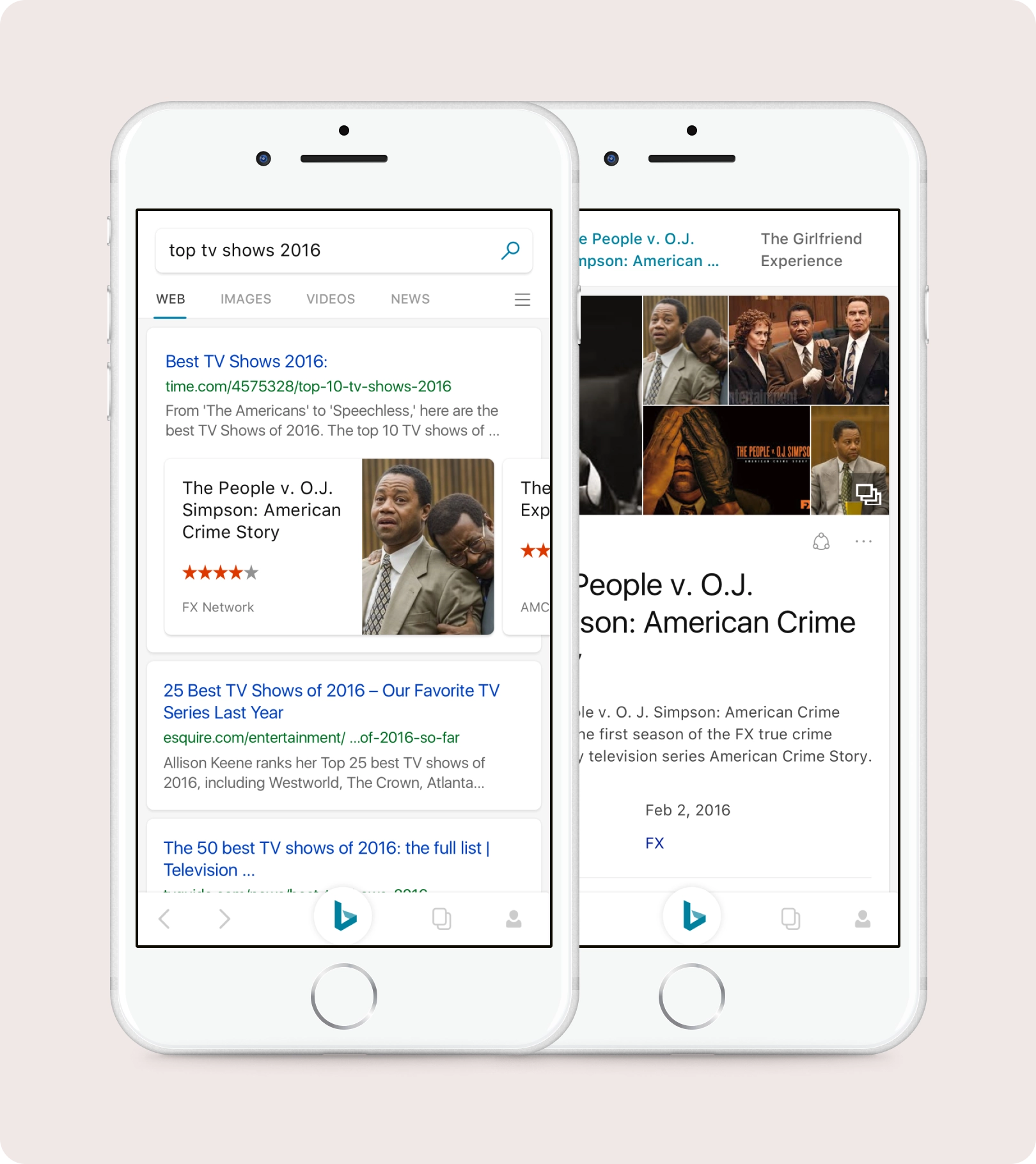
Every entity in the world covered
Restaurants / Places / Movies / TV Shows / Products / People
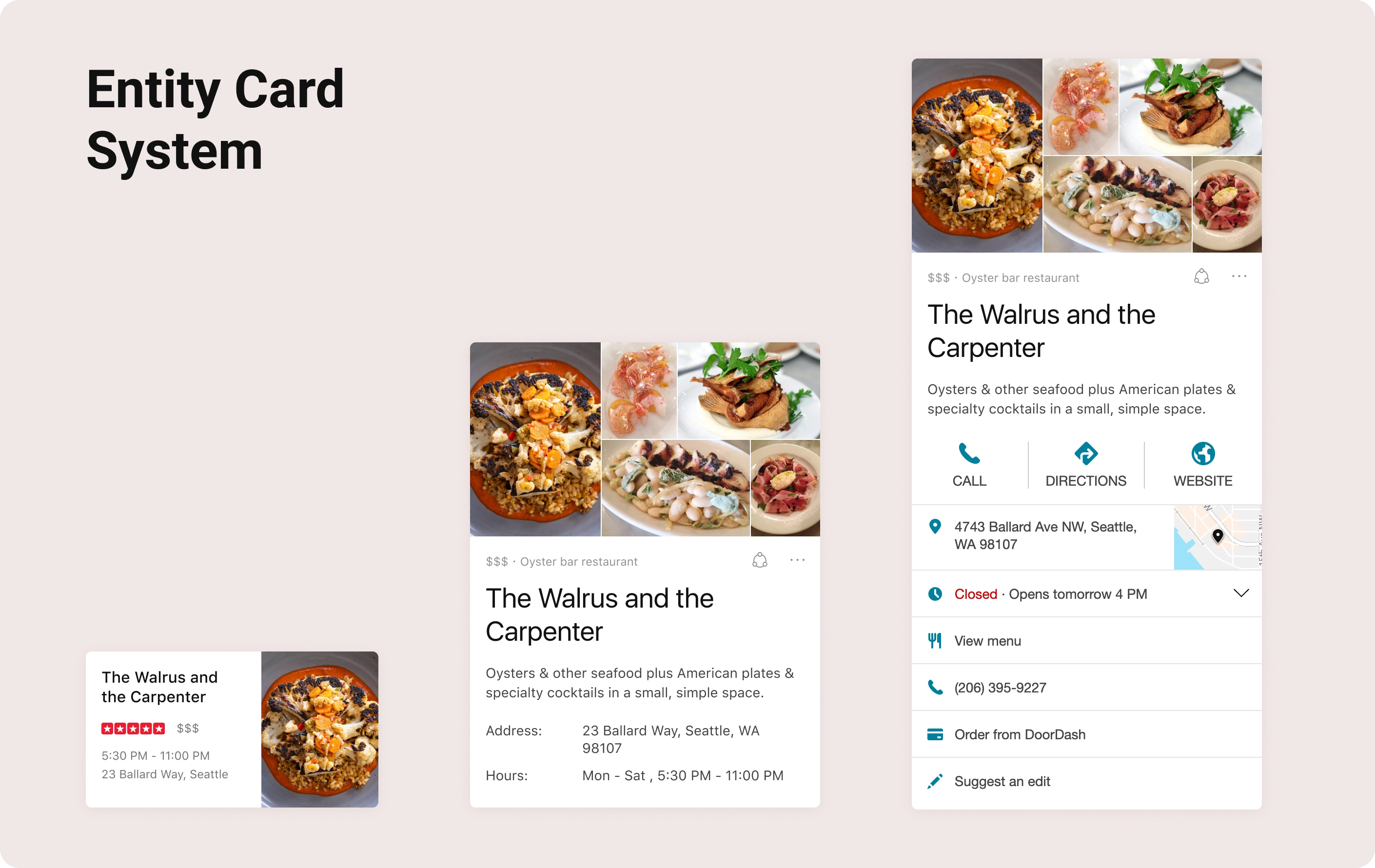
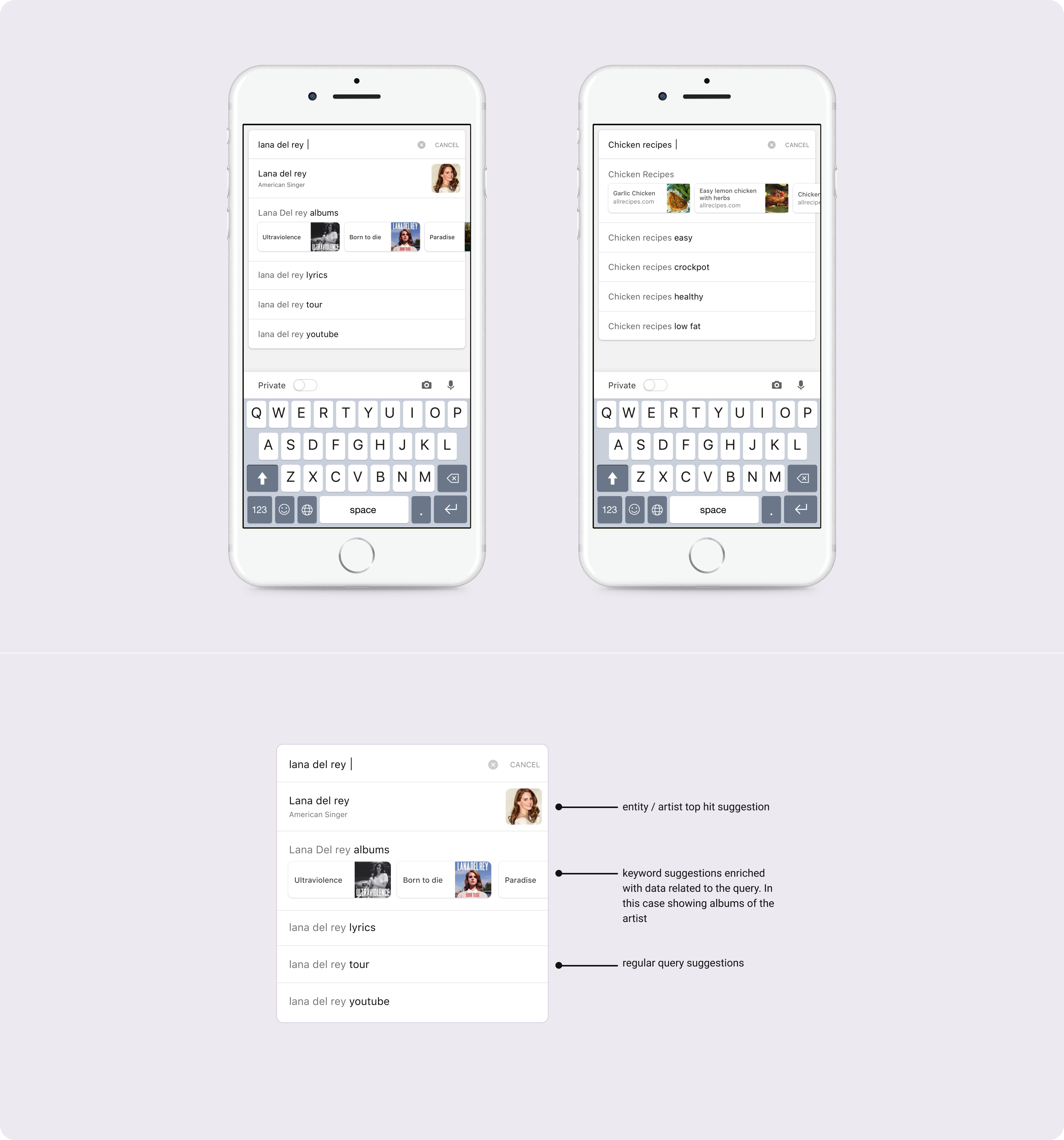
Entities and articles suggestions while you search
Search relies on being fast and accurate and find information with less user actions. In this below example as the user searches for lana del rey, not only the first hit is a validation for that person but the concept also bring albums of that artist.
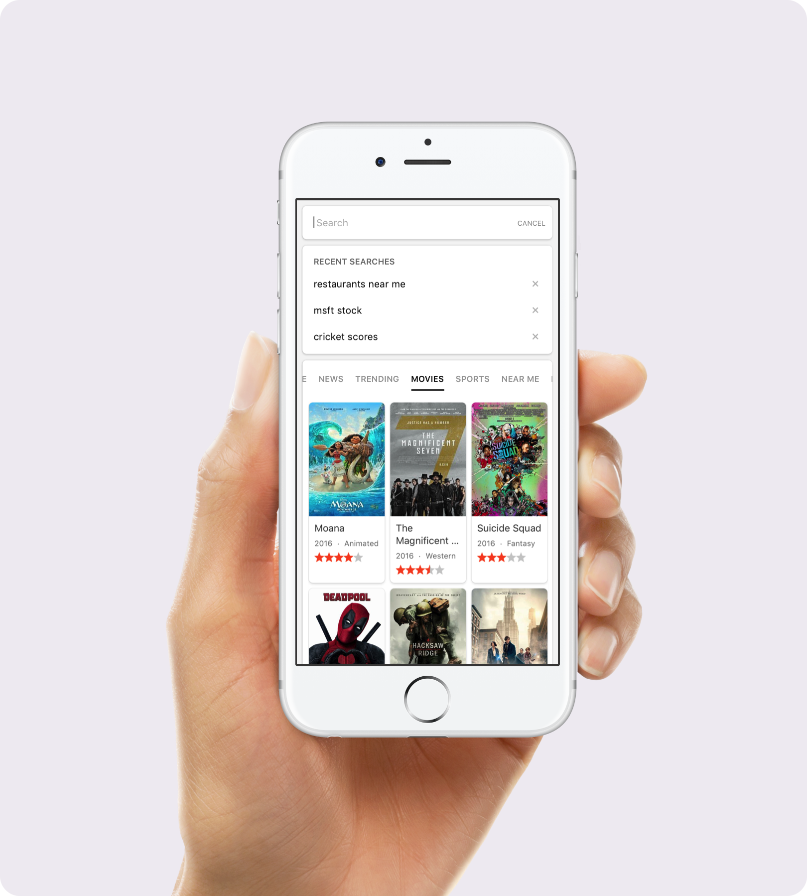
Enhancing query formulation
A better way to start your search
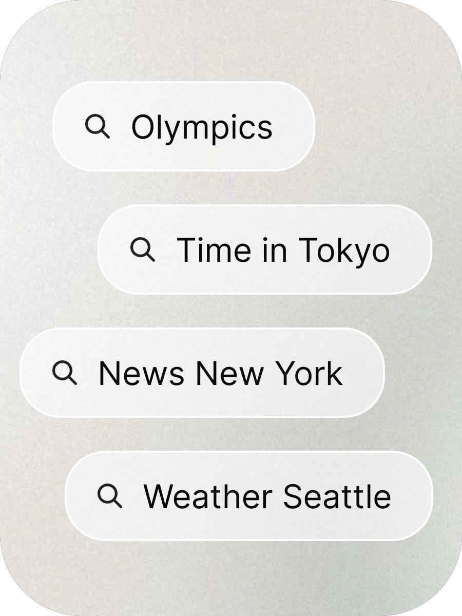
When the user taps the search box to query something, this new state bring together recent searches and an array of topics that users search more often. The state starts with trending searches but one can swipe to either see movies in theatres or scores of their fav teams. With the introduction of default search engines on mobile browsers, users had started to dropp off from the bing homepage where one could consume all this information. The idea was to bring all that richness to users who don’t go to Homepage anymore.
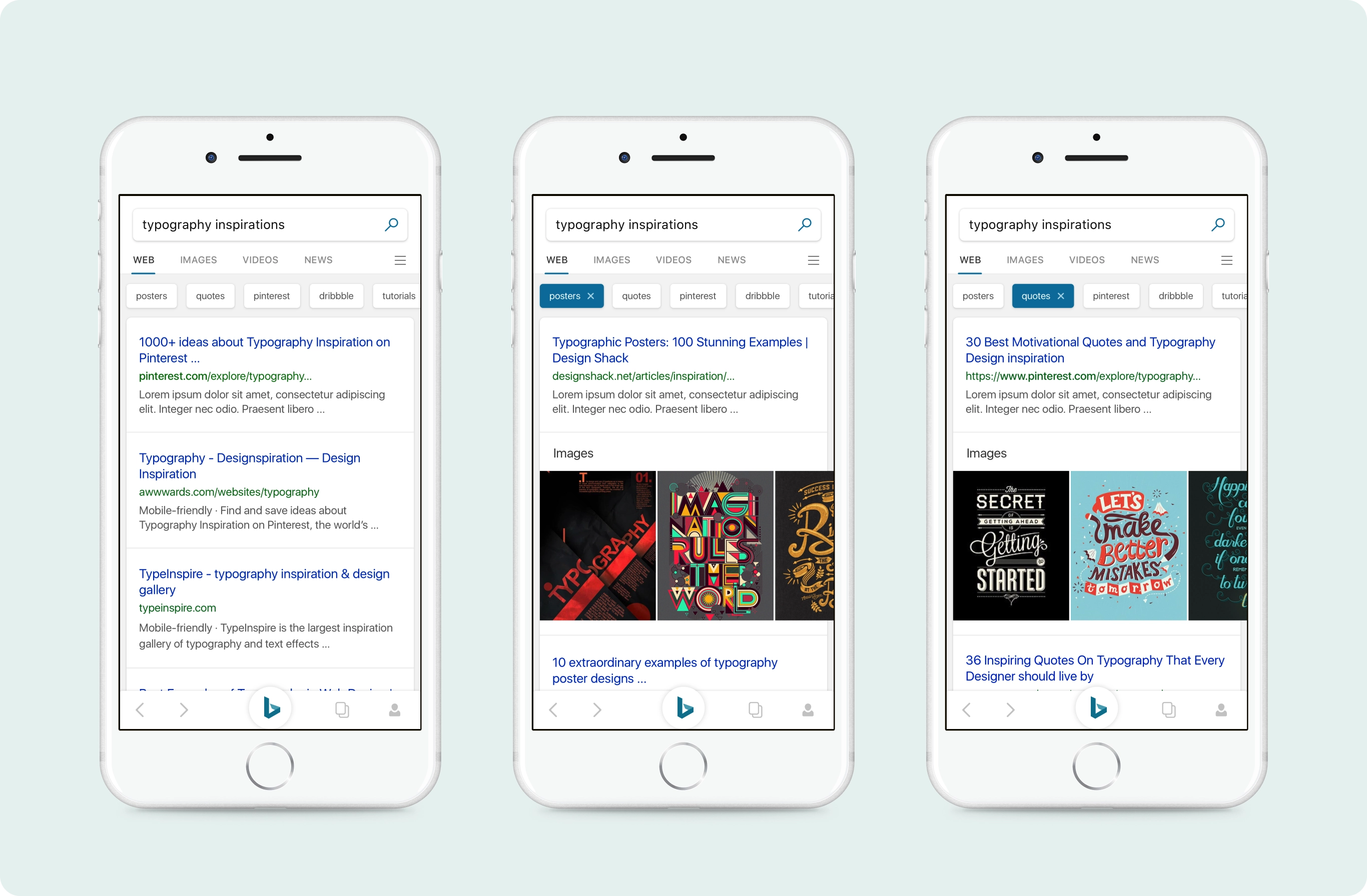
Simplifying query formulation with one tap refinements
Bing Homepage image is iconic and a strong brand element. How do you create an even more beautiful experience. The homepage is just not about the search, but a lot of elements which make the bing experience.
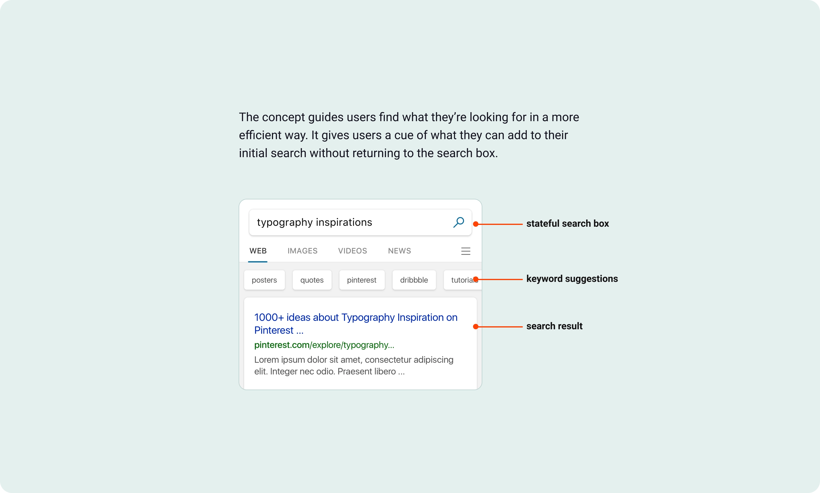
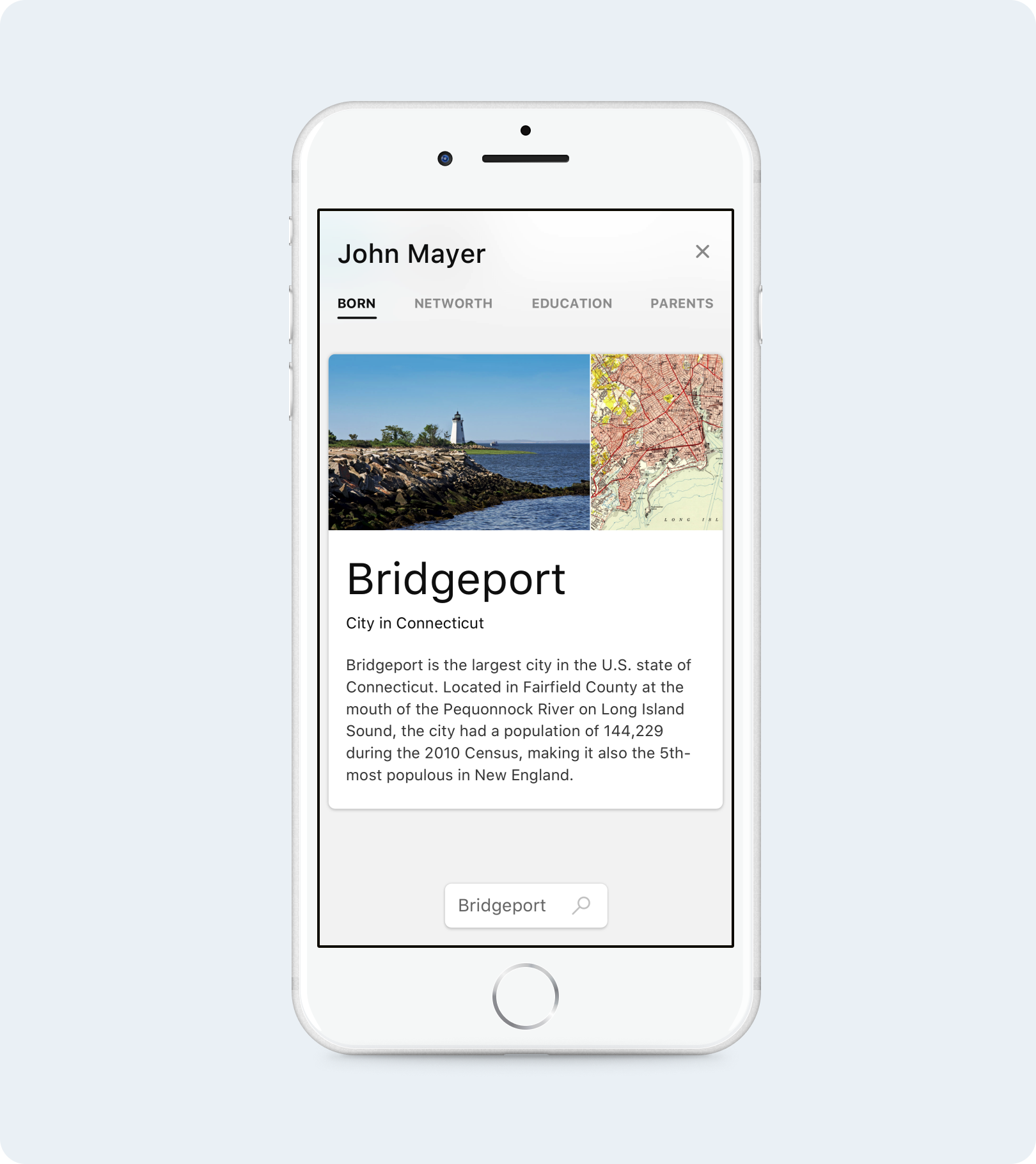
Quick Fact Previews
Organizing world’s information and bringing it to user’s fingertips have been core principles of Bing since it’s inception. Always kept our laser focus on enabling users to achieve task completition. This concept proactively brought information on the web in a bite sized card allowing users to explore without visiting the URL.
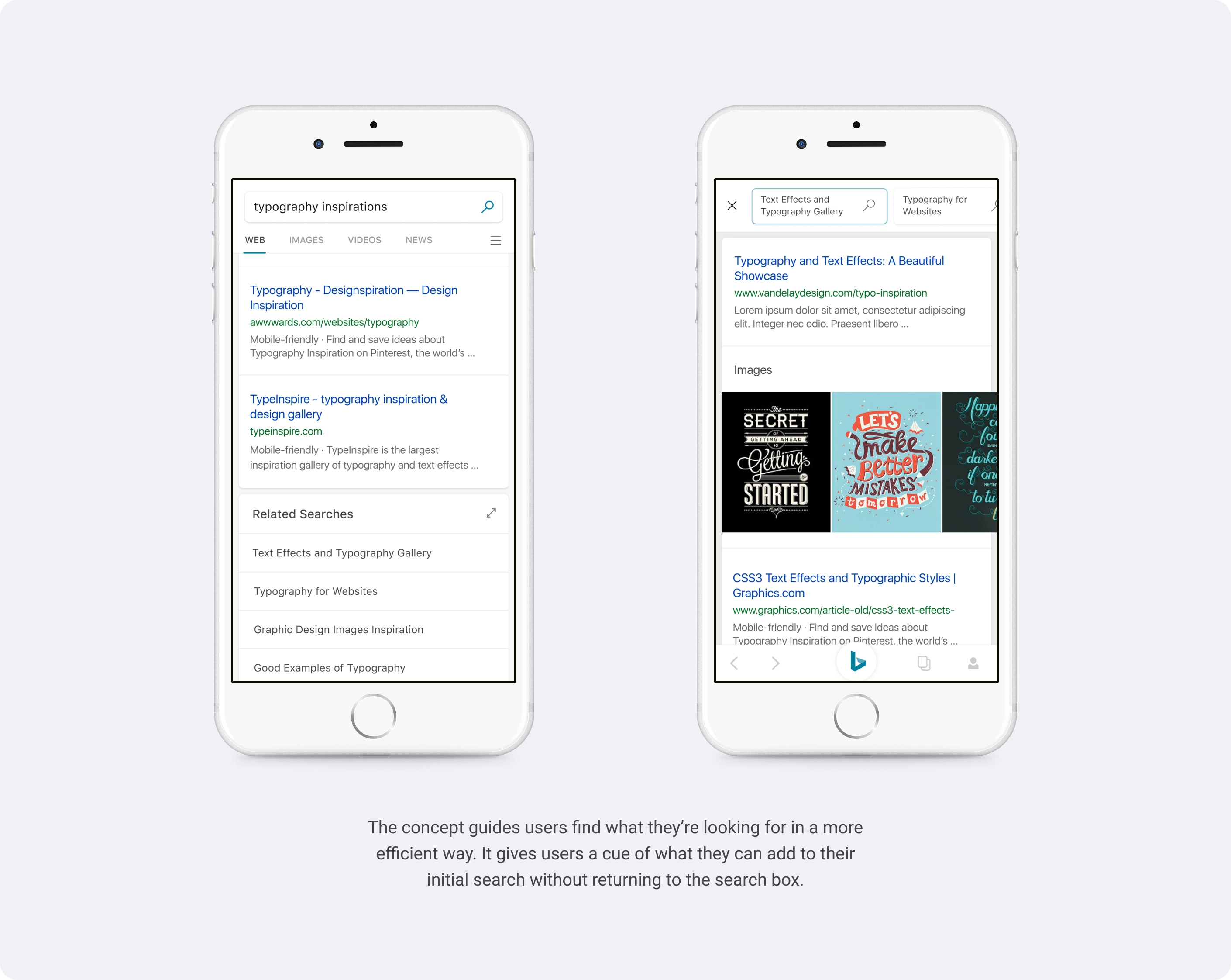
Related Searches
Search engine suggests similar searches that may be useful to explore. The current experience was a simple new page load which made it difficult to quickly check related searches. The new interaction model allowed the user to quickly swipe and see suggested results.

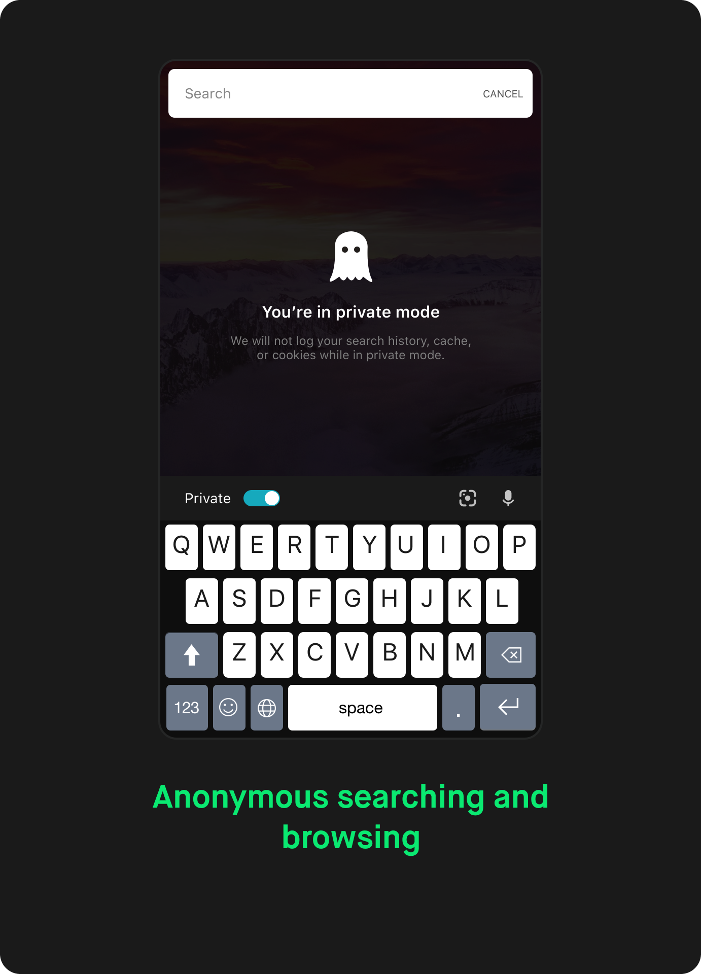
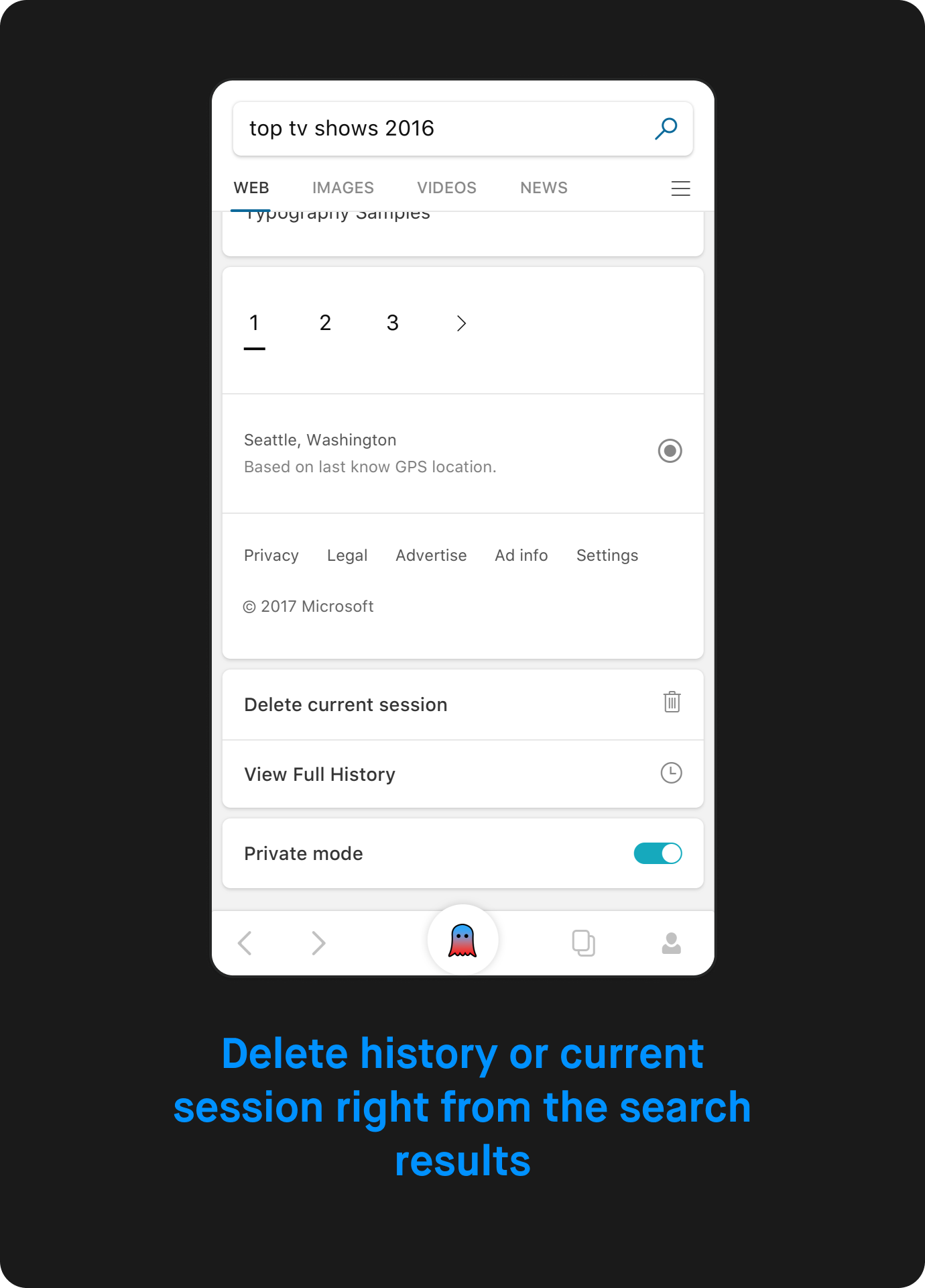
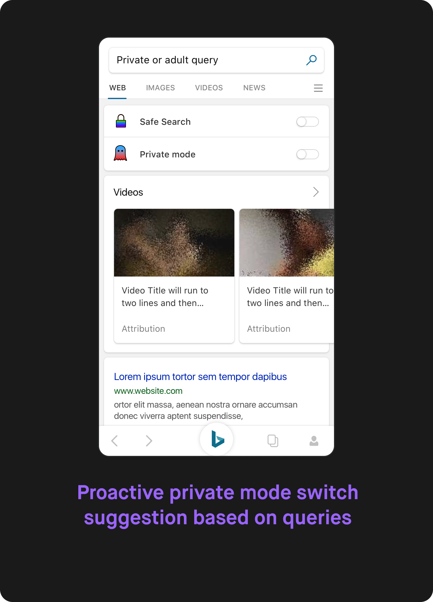
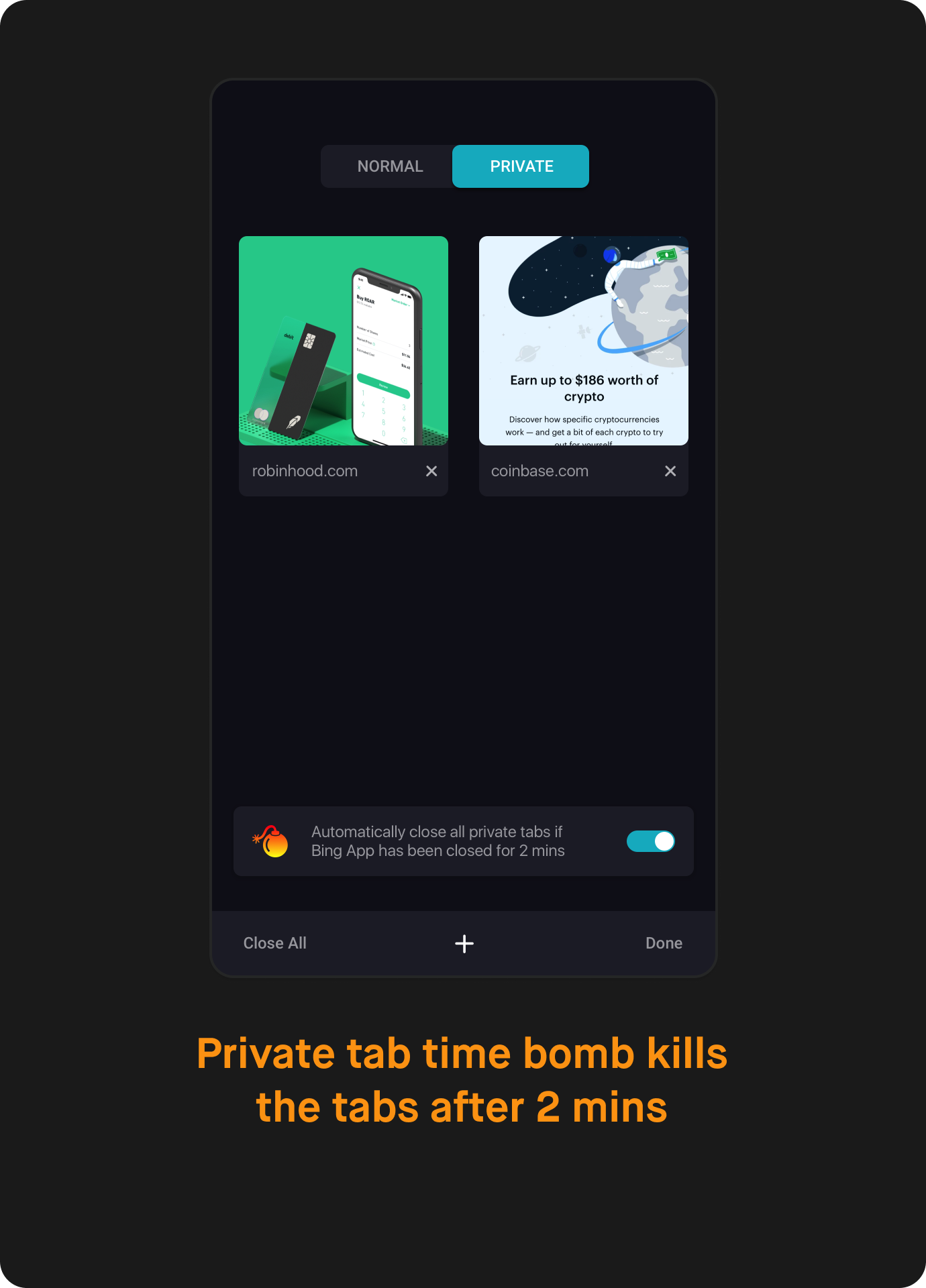
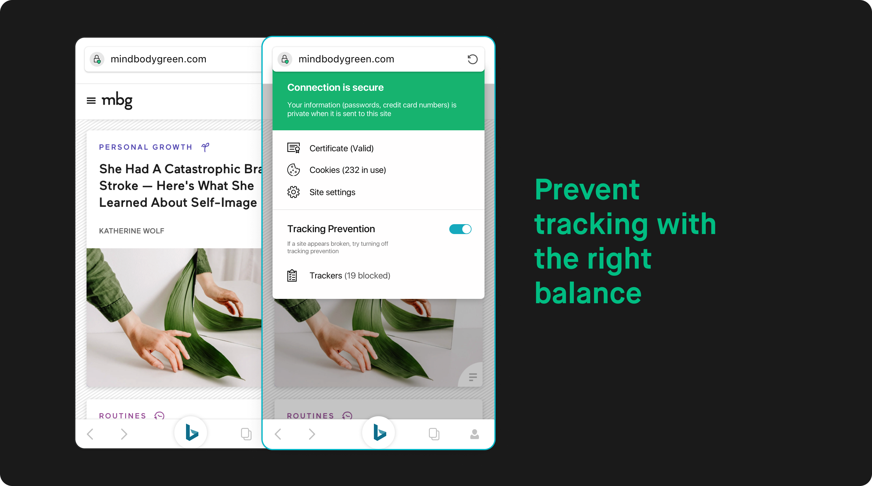
Take Privacy in your hands
A search engine that enables you to be private whenever you want is a necessity today. The goal was to create an experience that respects the user’s privacy and makes it effortless to switch to it and back to the normal mode. Also allowing users to quickly delete history for their specific query or a session.
Relooking the visual system
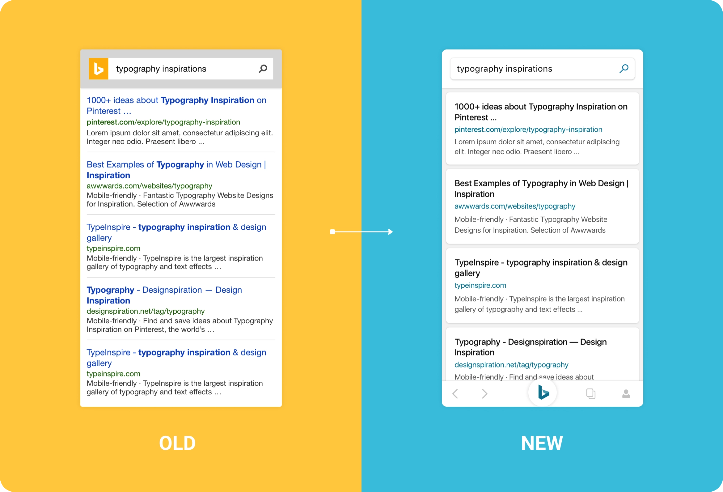
Cards
Clarity with Cards
Carding is a framework designed to group related content, increase scanability, and clearly define relationships between different types of content within a mobile context.
The distance between interface elements is fundamentally one-dimensional, lacking distinction between layers and components. The use of shadows helps communicate a feeling of depth to users, implying interactivity and enhanced content organization at a glance.
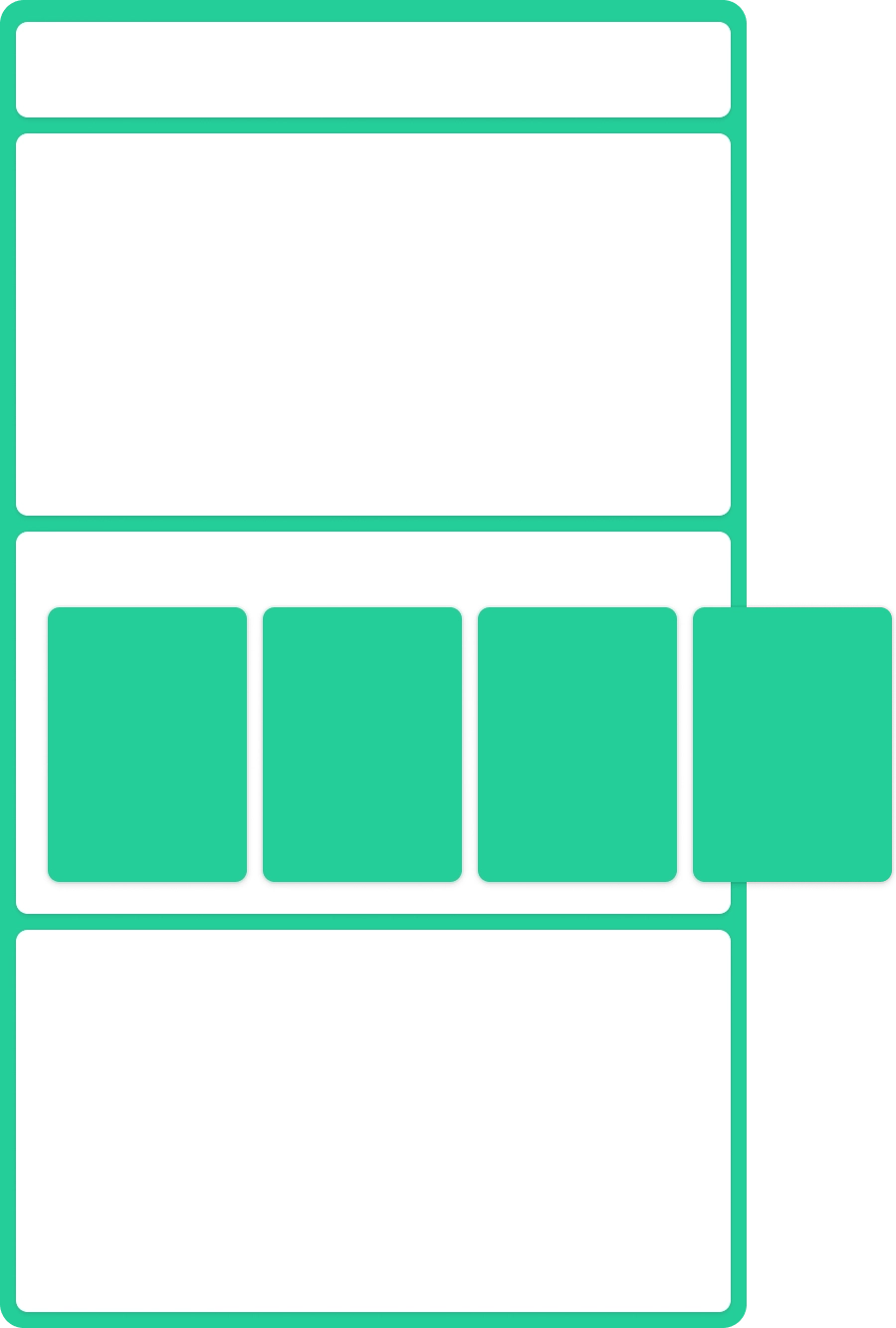
Colors
An inspired palette
Carding is a framework designed to group related content, increase scanability, and clearly define relationships between different types of content within a mobile context.
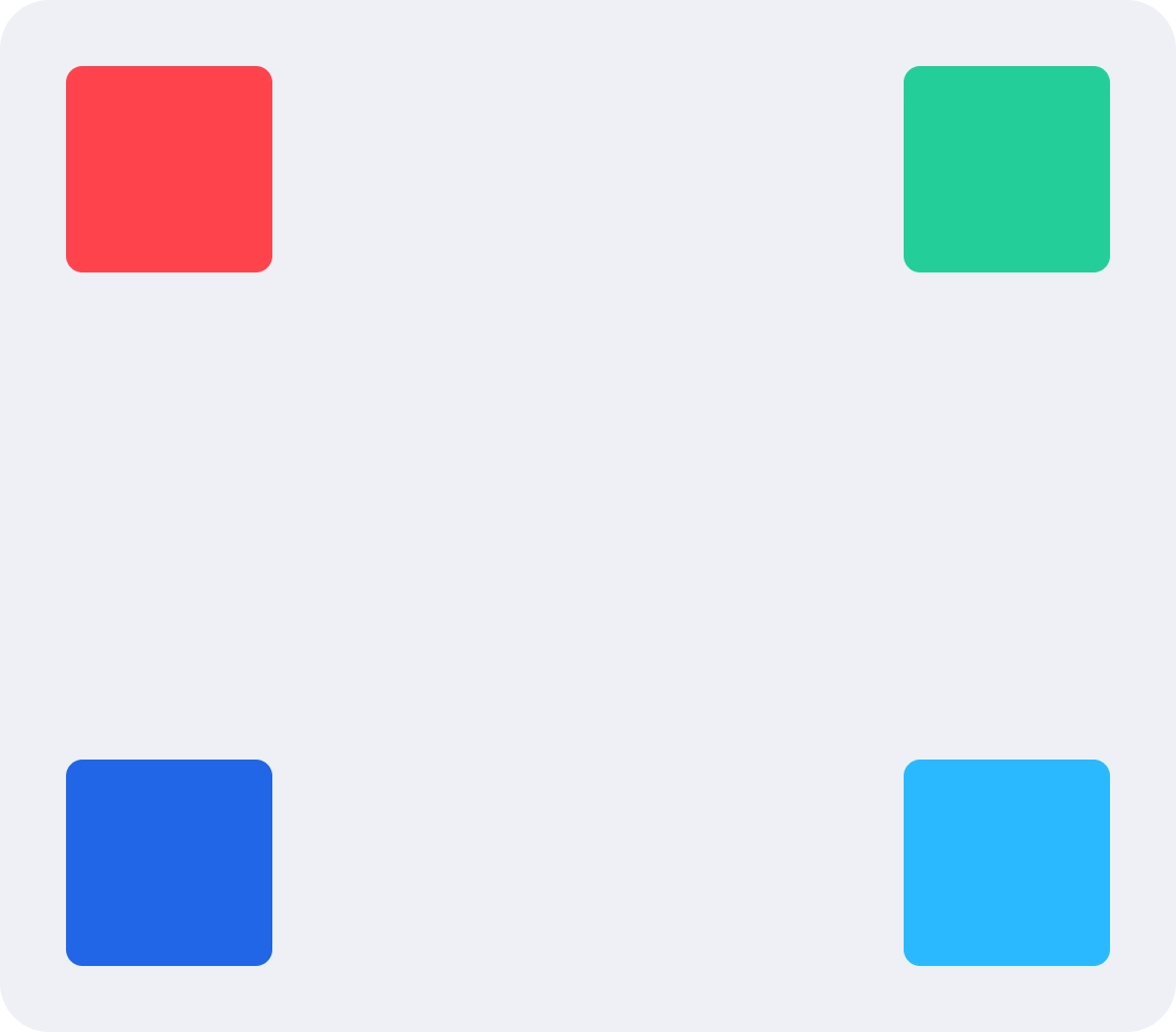
Typography
Confident and Clear
Carding is a framework designed to group related content, increase scanability, and clearly define relationships between different types of content within a mobile context.

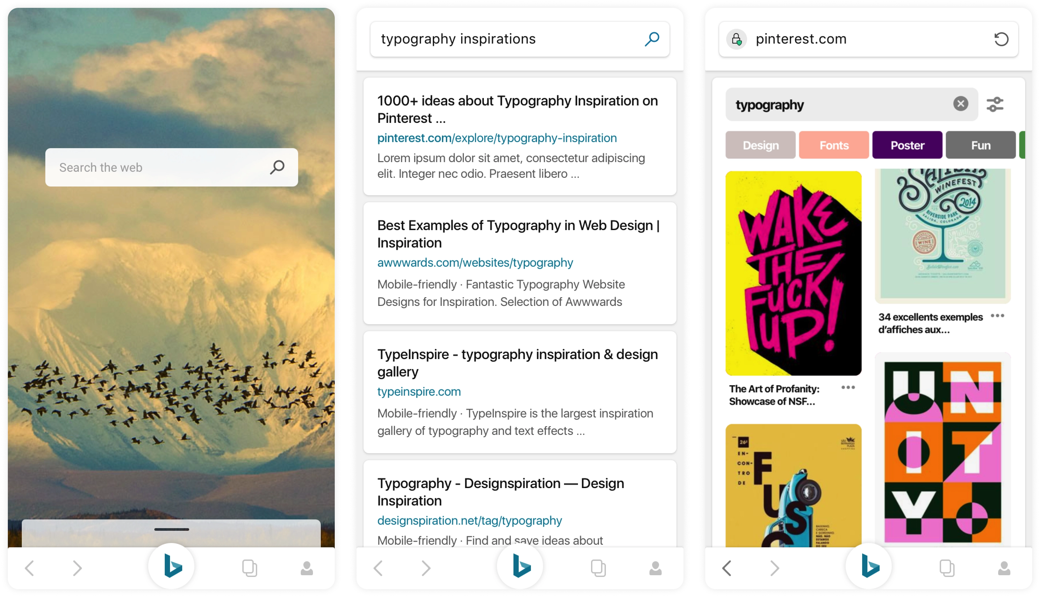
Bringing the re-defined elements together
Impact and Learnings
I had built a great reputation to think differently with my previous projects like Wordflow Keyboard, Windows Substrate, OneClip and others. That helped to land such a huge project out of all the talented designers in the team.
The experience while leading this project was phenomenal. Lot of concepts designed were later adopted by several teams and finally made into the product. The role of showing them the vision where search should go was successful. To test out the concept we did multiple flights with our users and got positive feedback. Personally it was an exciting journey as I was looking at a much broader landscape of design and concepts.